VeloguardX
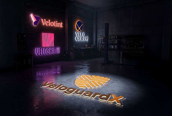
VeloguardX’s identity system was designed as a premium visual ecosystem where each sub-brand carries its own personality while staying rooted in a unified automotive aesthetic. The parent brand logo combines a geometric shield form with intersecting angular lines, symbolizing protection, precision, and engineered performance. The warm orange and deep brown palette creates a balance between luxury and reliability, giving VeloguardX a bold yet trustworthy presence.
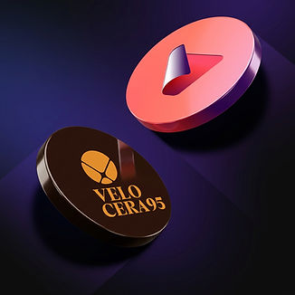
For Veloskin PPF, Brandity crafted a sleek striped monogram inspired by layered protection films, using vibrant pink and royal purple to express innovation and modern detailing culture. Velocera 95 Ceramic Coating features a refined emblem with sharp segmented forms paired with an elegant serif wordmark, reinforcing sophistication, durability, and premium coating technology. Velotint™ adopts a fluid abstract “V” symbol with gradient transitions that visually communicate shade, clarity, and motion. Together, the four logos establish a cohesive and future-forward automotive protection brand language.